

Howaubi
50 Days of Design
Over 50 consecutive days, I created 150 graphics using one repeatable rule: three designs a day, with a new palette every five days. A recognizable Howaubi visual vocabulary emerged through the work, collected in The Blueprint, a 68-page editorial archive.

01 / The rule
A fixed structure. An open brief.
Three graphics each day gave the project a consistent unit of work. Keeping one palette for five days created room to explore different subjects without starting from a completely new visual system each morning.
Each group holds fifteen designs. Starter is the first of ten palette groups, followed by C, P, S, R, M, B, F, L and T. The day numbers here describe that sequence, not a dated calendar.
- 3 designs / day
- 5 days / palette
- 15 designs / group
02 / Palette index
Ten limits. Many directions.
The palette changes every five days, while the daily rule stays fixed. Across the book, muted tonal groups sit beside brighter, higher-contrast combinations. The colors provide continuity within each group without prescribing a subject or a single way to draw.
03 / Selected studies
Sixteen views into the archive.
This selection follows a widening range of subjects: abstract marks and emblems, then botanical forms, animals, architecture, objects and pattern fields. It is a story of variation, not a straight line from simple to complex. Quiet studies matter as much as intricate ones.
Palette Starter
A recurring mark
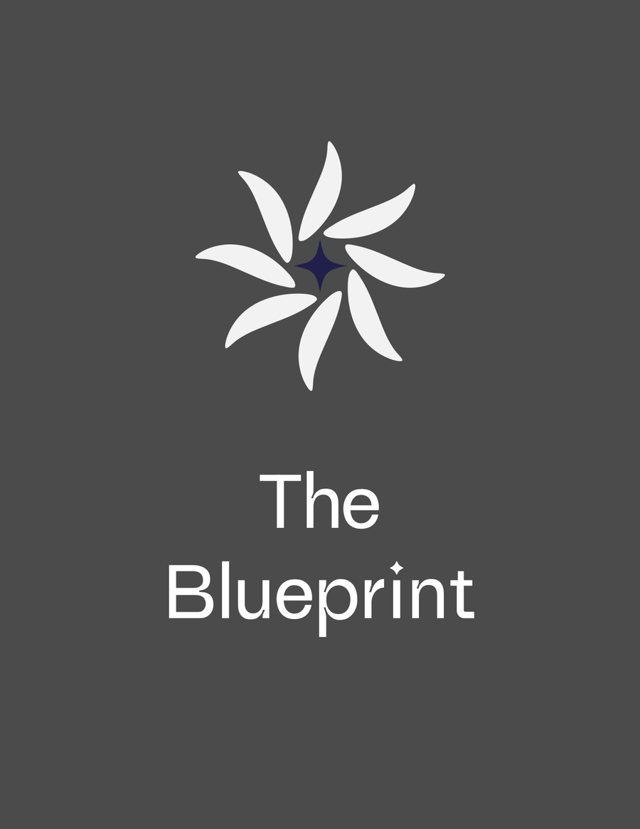
A black rosette turns around a violet four-point star. Both forms recur in the collection, sometimes as the subject and sometimes tucked into another object.

An unnamed study from the Starter group. This is a descriptive label, not an authored title.
Palette C
Flat marks, soft volume
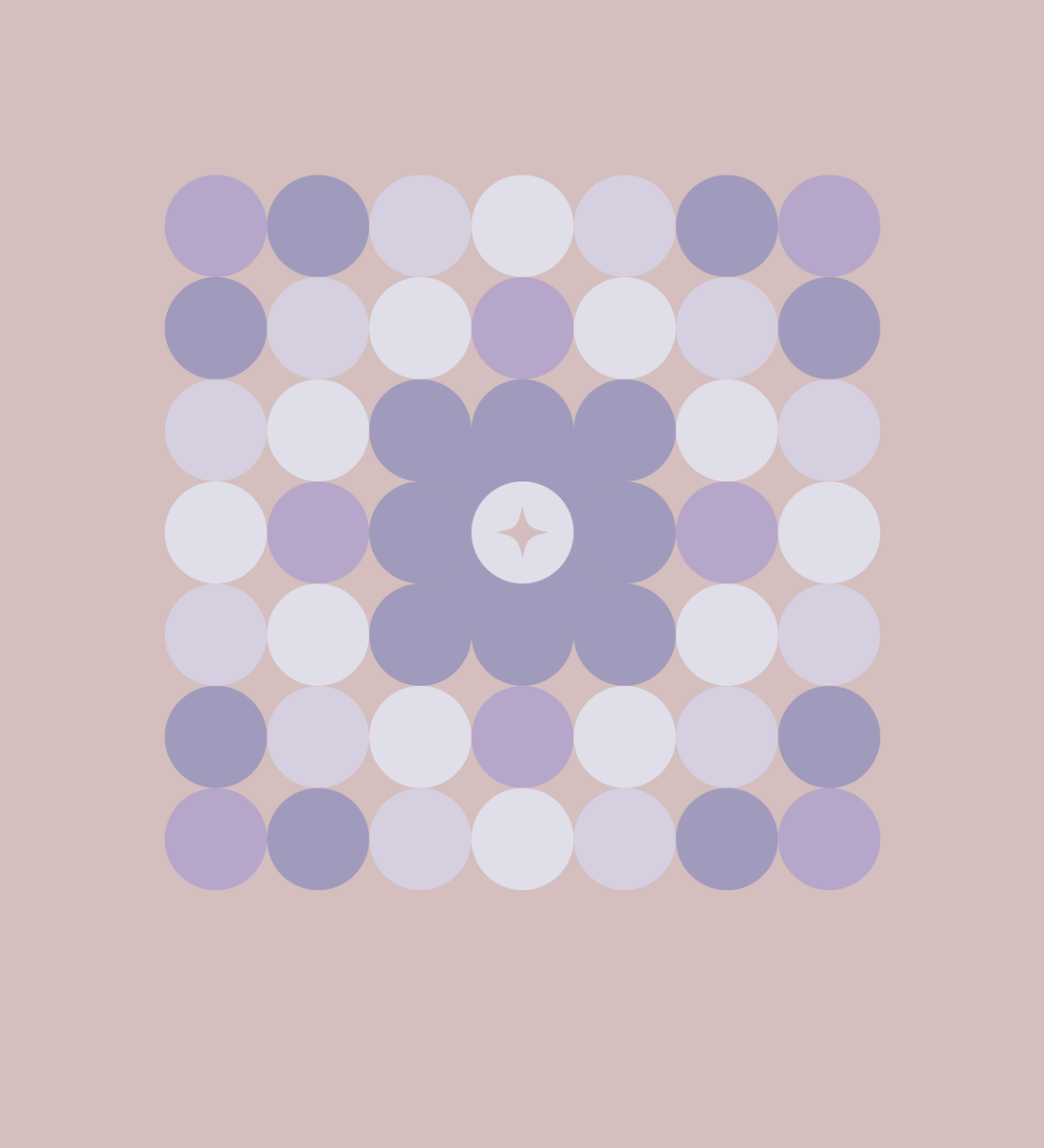
Circumvent builds a central emblem from circles. Chroma brings curved surfaces and soft shading into the same restrained color family.

Palette P
A different tonal register
Parasol combines a shaded center, a fan of fine radial lines and an outlined base. Rust and ochre shift the mood without losing the central star.

Palette S
Geometry becomes a window
Stained glass places a flower-like construction inside a square frame. The pale field, purple shapes and blue corner details keep each layer distinct.

Palette R
Two ways to repeat a line
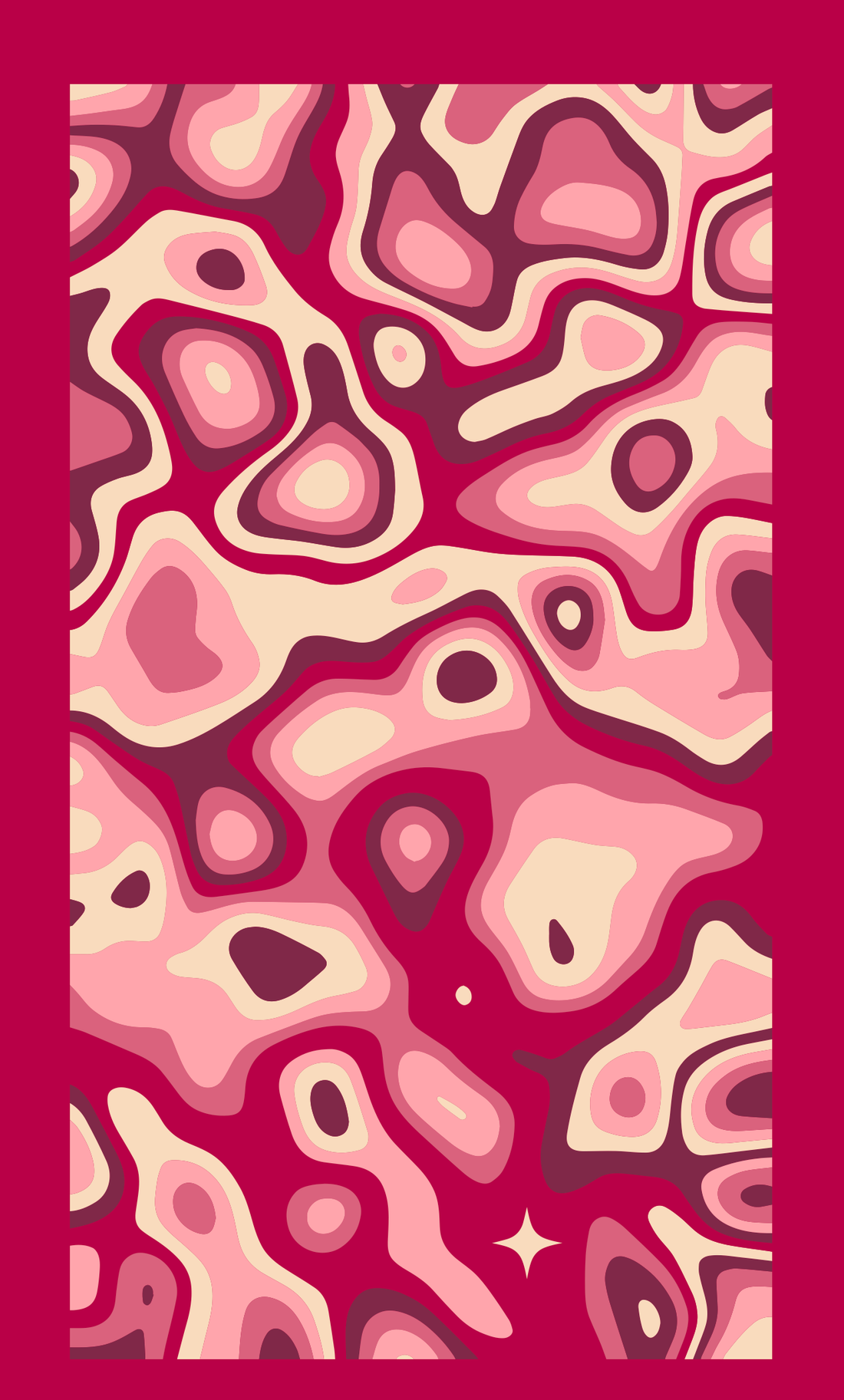
Ribbons holds parallel curves in a mirrored emblem. Rivers spreads its contours across a rectangular field, letting repetition become the whole composition.

Palette M
Pattern and personality
Mandala concentrates repeating forms into a dense radial composition. In Music, the rosette and Howaubi name become details on a record player.


Palette B
Living forms, everyday objects
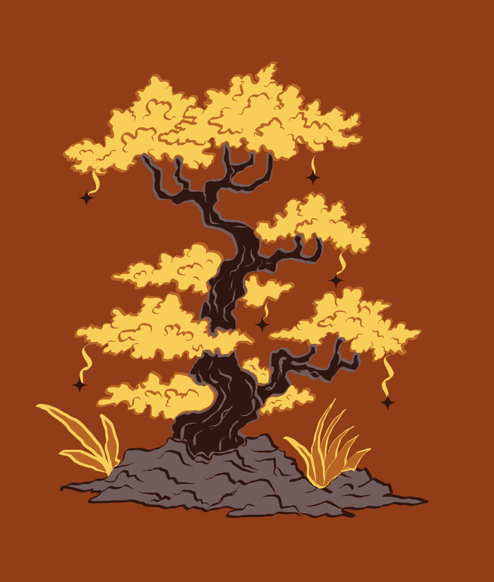
Bonsai uses branching detail and layered foliage. Bento uses planes, outlines and a repeating box edge. The limited palette holds two different approaches together.

Palette F
Density and restraint
Fossil accumulates colored bands into a spiral. Fingerprint strips the composition back to broken contour lines and a single small star.

Palette L
A quieter kind of depth
Lemon + Lime uses pale color, a cut surface and a soft shadow to describe a familiar object. The star remains part of its silhouette.

Palette T
A vocabulary carried forward
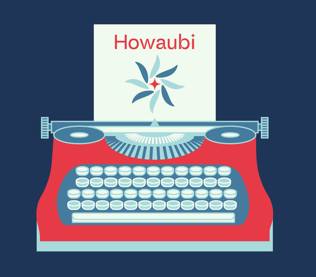
Trefoils interlaces colored bands in two related constructions. Typewriter places the Howaubi name and rosette on its paper, bringing the identity into another everyday object.
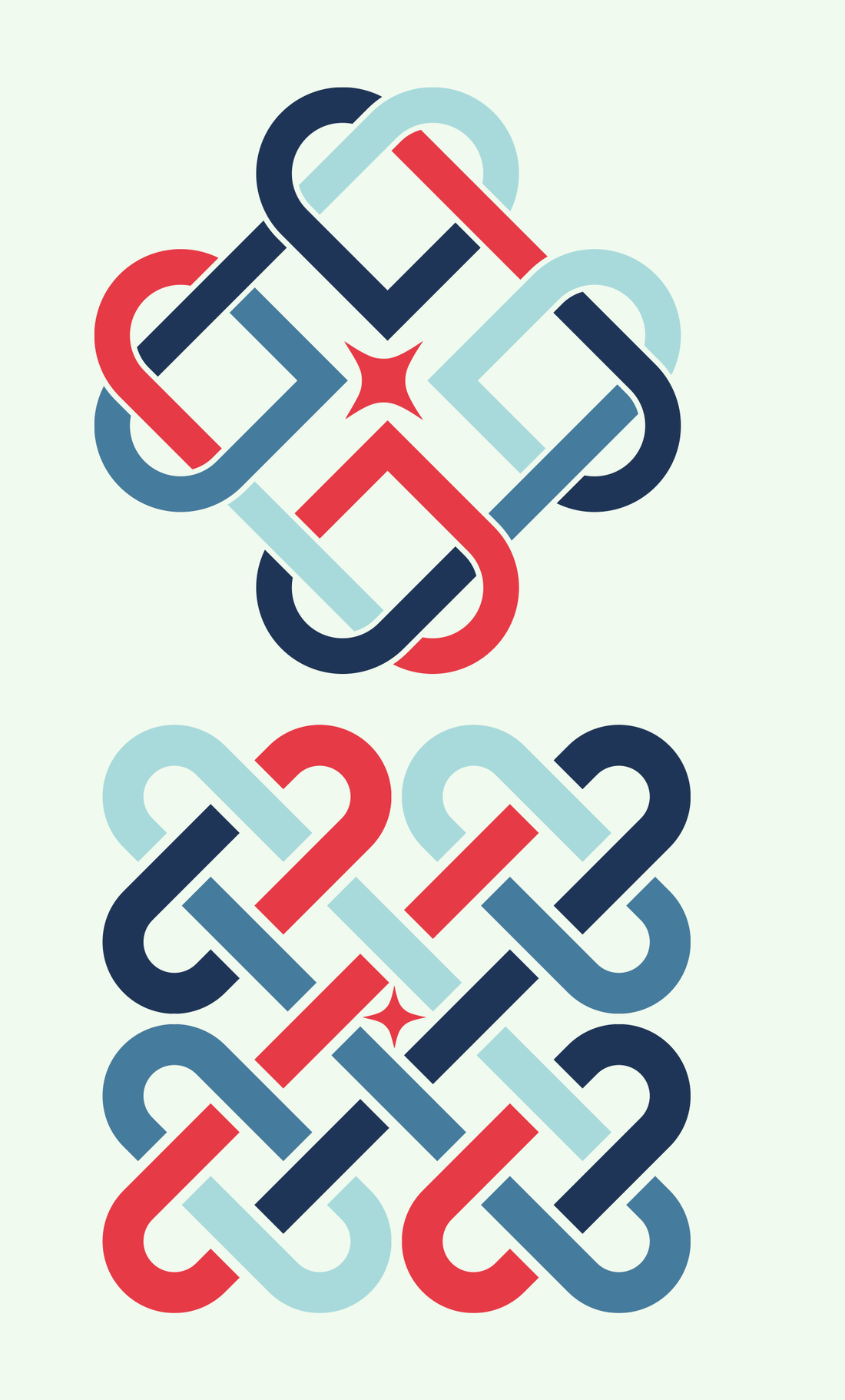
Both interlaced forms belong to the single indexed work, Trefoils.
04 / Visual language
An identity through repetition.
Howaubi became recognizable through a vocabulary that kept returning: four-point stars, rosettes, symmetry and geometric repetition. Those forms could fill a composition or become a small signature within it.
Music and Typewriter make that relationship explicit, placing the name and mark inside illustrated objects. This was not a separate brand-strategy exercise. The identity took shape through sustained making, as familiar elements found different roles across the graphics.
05 / The complete archive
Daily work, given an editorial form.
The Blueprint brings the individual graphics into a 68-page book. Palette openings introduce each group, followed by five daily pages. The index gives the later work names and a place to return to, while the introduction and closing pages frame the collection.
The archive contains all 150 designs: 135 named in the index and fifteen unnamed Starter studies. The reader preserves the cover, facing-page relationships and closing material in their original order.
The Blueprint
The complete 68-page archive
Original page order. Use the reader controls or focus this reader to use arrow keys.
06 / Making and organizing
Graphics first. An archive that holds them.
Adobe Illustrator was the tool for the graphics. Working across a fixed daily quantity and limited palettes left the subjects open: a shape could be repeated into a field, shaded into an object or combined with an existing motif.
Adobe InDesign brought that output into The Blueprint. Grouping the work by palette and day made the archive navigable without flattening its variety. The book also records Adobe Premiere Pro as the tool used to edit Illustrator tutorial videos.
- Illustrator / graphics
- InDesign / book
- Premiere Pro / tutorial editing
07 / Reflection
Consistency does not require sameness.
A repeated rule gave the project continuity while leaving space for different subjects and degrees of detail. Returning to a motif did not mean using it in the same way. Sometimes it anchored the graphic; sometimes it became a small detail in a larger scene.
Collecting the work changed its context, too. The daily graphics became something that could be read across palettes, compared and revisited. The Blueprint gives that sustained exploration a structure without turning the individual pieces into one uniform style.